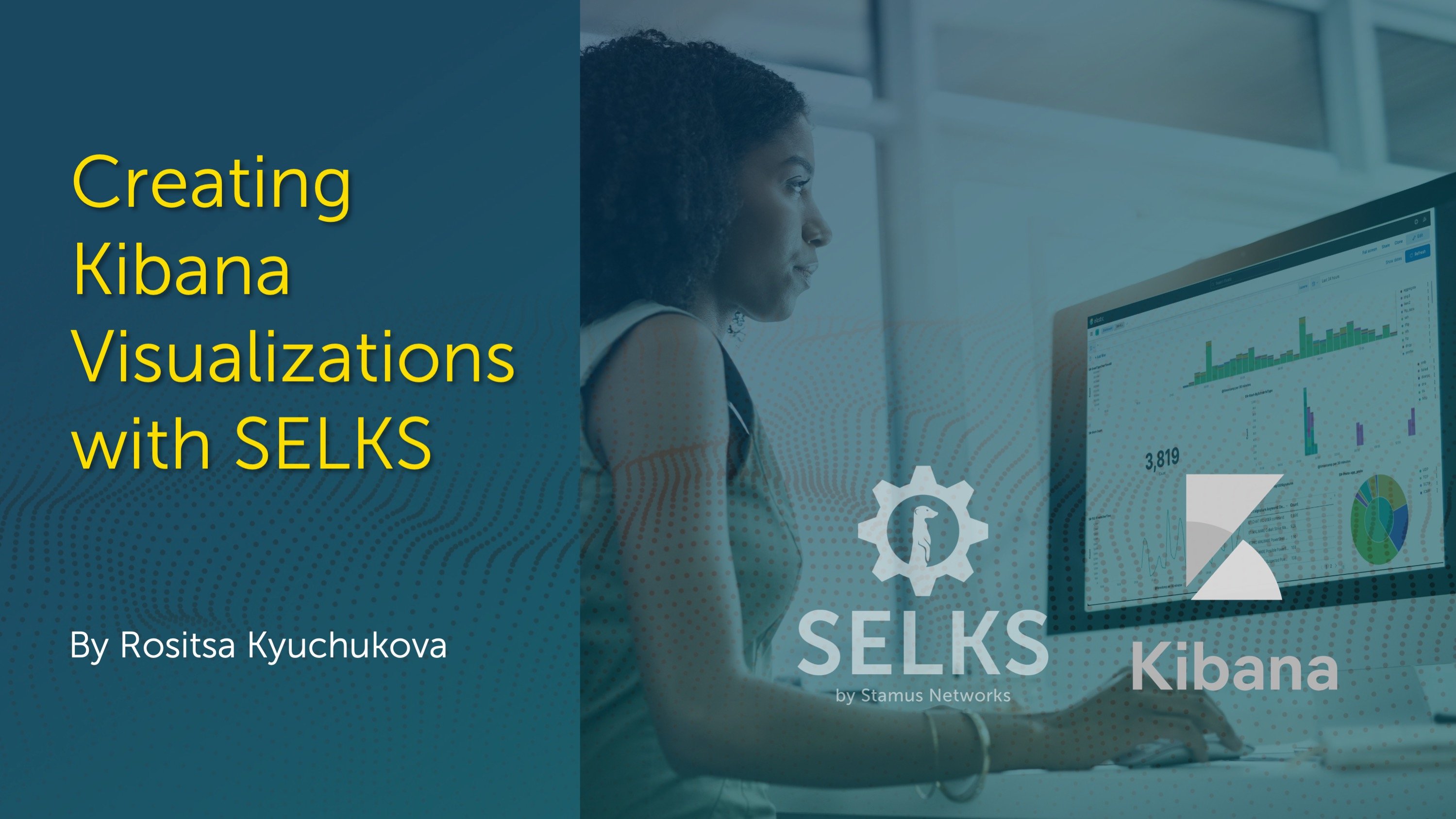
Visualizing network security logs or data is a crucial aspect of effectively analyzing and interpreting information. Today we will explore the process of creating Kibana visualizations using SELKS (now Clear NDR - Community), a powerful and feature-rich open source Debian-based IDS/IPS/Network Security Monitoring platform released under GPLv3 from Stamus Networks. With Clear NDR - Community (formerly SELKS), you can easily create visually appealing and insightful visualizations to gain valuable insights from your data using Kibana from the ELK stack.
This specific example will walk you through creating an application layer protocol breakdown based on flow records produced form Suricata.
You read that correctly - one of the many powerful features of Suricata is that it can create protocol and transaction logs regardless of alerts: that includes flow, anomaly, alert, protocol, and file transaction logs, plus file extraction and PCAP.
Here is a full list and details of what those logs and transactions look like. Any and all data in Clear NDR - Community is generated by Suricata.
Let's dive into the steps involved in creating Kibana visualizations with SELKS.

A Glimpse into Data Storytelling: Unveiling Kibana's Visualize Library
Before we proceed with creating our visualization, let's swiftly examine the features of Kibana's Visualize Library.
The "Visualize Library" in Kibana is a collection of powerful data visualization tools and options that allow users to create various types of charts, graphs, and visual representations of their data. It is an integral part of Kibana, which is an open-source data visualization and exploration platform developed by Elastic.
With the Visualize Library, you can transform raw data into meaningful and insightful visualizations, making it easier to understand complex datasets. These visualizations play a crucial role in data analysis, as they provide a clear and intuitive way to identify patterns, trends, anomalies, and correlations within the data.
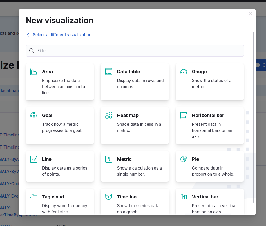
The Visualize Library in Kibana offers a wide range of visualization types, including:
- Bar Charts: Suitable for comparing data across categories or groups using vertical or horizontal bars.
- Line Charts: Ideal for illustrating trends and changes in data over time.
- Pie Charts: Useful for displaying the proportion of different categories as parts of a whole.
- Area Charts: Similar to line charts, but the area between the lines is filled, emphasizing the volume of data.
- Heat Maps: Effective for visualizing data density and patterns across two dimensions.
- Data Tables: A tabular representation of data with various formatting and aggregation options.
- Metric Visualizations: Displaying single values, counts, or metrics using numbers or gauges.
- Coordinate Maps: Geospatial visualizations on maps, indicating data points based on coordinates.
- Tag Clouds: Representing data with tags, where the size of the tag indicates the frequency of occurrence.
- Timelion: A time series visualizer for time-based data with various functions for data manipulation.
Users can customize the visualizations by selecting the data source, choosing the relevant fields, applying filters, and selecting appropriate chart types and options.
Step 1: Accessing the Kibana Visualize Library
To begin creating your own visualizations, navigate to the Kibana menu and select "Visualize Library." This is where you will find a wide range of visualization options to choose from. Follow these steps:
- 1. Load SELKS UI: Open your web browser and enter the URL of the SELKS user interface (UI). This should take you to the SELKS dashboard.
- 2. Click on the Apps Switcher Menu: Look for the "Apps Switcher" menu, located in the top-right corner of the SELKS dashboard. Click on it to see a list of available apps.
- 3. Select Kibana: From the apps list, find and click on "Kibana." This will take you to the Kibana interface.
- 4. Load Kibana: Wait for Kibana to load. Once the Kibana interface is fully loaded, you should see various options and menus.
- 5. Click on the Left Navigation Menu: In Kibana, you'll find a left navigation menu with different sections and functionalities. Under the “Analytics” section, click on the "Visualize Library" option.
- 6. Access Visualize Library: Clicking on "Visualize Library" will take you to the library.
Step 2: Creating a Visualization
Now, let’s move on with creating our first visualization. To do this, we first have to click on the "Create Visualization" button in order to start the process.

Once you have clicked on the button, you will be presented with various types of visualizations to choose from, such as Aggregation-based, Lens, and more. Select the type that best suits your requirements.
Step 3: Choosing the Display Format
Once you have selected the visualization type, it's time to decide how you want to display your data. Kibana offers a variety of display formats, including Metric, Pie, Gauge, Data table, and more.
Pick the format that effectively represents your data and provides the insights you need.
Step 4: Selecting the Data Source
In SELKS, data sources are organized based on event types. For example, TLS protocol events belong to the "logstash-tls*" data source, while DNS protocol events are part of the "logstash-dns*" data source. Choose the appropriate data source for your visualization to ensure you are working with the relevant data.
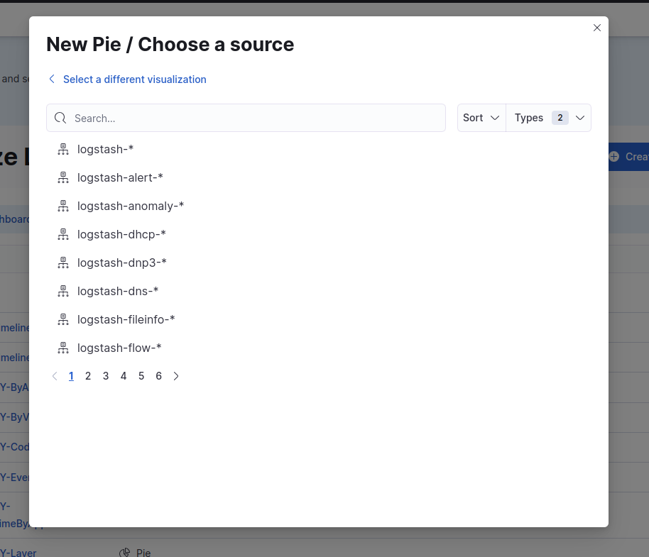
Note: Data sources in Clear NDR - Community Kibana are available by event type. Thus, TLS events are part of the logstash-tls* data source/index; DNS are part of the logstash-dns* data source/index, etc. All those data sources are already configured and created by SELKS.
In our example, the visualization will be based on the “logstash-flow-*” data source.This index has all the flow logs produced by Suricata.
Step 5: Configuring the Visualization
The next step involves configuring your visualization by selecting the appropriate metrics and buckets. Metrics represent the data you want to analyze, while buckets allow you to segment and group the data for a more detailed analysis. In the next example, we will visualize the mean average alerts severity over a selected time range. To be able to visualize this, we have to select the “Aggregation-based” option. Next, we will select the type of visualization we are going to use. In our case, we will use the Pie chart visualization. Once we have selected the type of visualization, we are going to choose the data source, which would be “logstash-flow-*”. In this example, we will create a visualization, application layer protocol usage based on flow records produced by Suricata. In order to configure our visualization, we have to choose its Metrics, like Aggregation and Field. In our example, we are going to use the “app_proto.keyword” and aggregate by “unique count”.

A few words on Metrics - in Kibana’s Visualize Library, Metrics are numerical values representing aggregated data, such as counts, sums, averages, or other mathematical calculations. They provide the quantitative aspect of the visualization.
Step 6: Updating and Reviewing Your Visualization
Once we have configured the Metrics on our visualization, we can also configure the Buckets. Buckets define how the data is divided or grouped. They are used to segment the data based on specific criteria, and each bucket represents a distinct category or interval. In our example, we are going to use the “Split slices” and use the Terms Aggregation on the “app_proto.keyword” field. In Kibana's Buckets, a "terms aggregation" is a type of bucket that allows you to categorize data based on the unique values found in a specific field. We will order the results alphabetically in ascending order. On the “Options” tab, we are going to select the Pie chart settings, like “Show tooltip”, “Show legend”, the legend position, etc.


Once we have configured all of this, we should click on the “Update” button located at the bottom right corner of the page. This will refresh the visualization based on the chosen settings and data. It is important to note that you may need to adjust the time range to ensure you are working with relevant data.

Step 7: Saving Your Visualization
If you are satisfied with the visualization you have created, you can save it for future reference. Simply click on the "Save" button, and your visualization will be stored in the Kibana environment. This allows you to access and utilize the visualization whenever needed, for example to be imported and used in a dashboard.

Step 8: Accessing Your Visualizations
Once saved, your visualization will be visible in the "Visualize Library." This is where you can manage and organize your visualizations, making them easily accessible for further analysis or sharing with others.
Note: It is recommended to provide descriptive names and appropriate tags to your visualizations for easy identification and categorization.
Creating Kibana visualizations with Clear NDR - Community enables you to explore and visualize your data in a meaningful way. By following the above steps, you can unlock valuable insights and gain a deeper understanding of your security events and system performance. Remember to refer to the Clear NDR - Community documentation for detailed instructions and specific configuration options based on your setup.
Start creating visually compelling visualizations with Clear NDR - Community and leverage the power of data visualization to enhance your security analysis and decision-making process. Happy visualizing!
To be notified of new blog posts and other news, make sure to subscribe to the Stamus Networks blog, follow us on Twitter, LinkedIn, and Facebook, or join our Discord.